Wednesday, October 15, 2014

Black is the New Black…the sequel


Over my time writing this blog, the post that has been read and shared the most is by far Black is the New Black.  Wood look tile is a highly debated topic on home websites such as Houzz, HGTV, and various blogs.  After nearly a year of living with our wood-look tile, I have decided to revisit my post from a year ago.  This post will be my opinion based on my experiences.

When it was time for us to make a flooring decision for our new home that we were remodeling, we really wanted wood.  We had some major concerns with adding real wood though 1.) we have two young, rambunctious boys 2.) we live in Florida where heat and humidity are a problem 3.) we have a pool and water is frequently tracked through the house.  Given these concerns, we decided that wood was not in our best interest.  After a long search, we went with Marazzi American Heritage porcelain planks in the color spice.  We have been living with this tile for nearly a year and I would like to address some of the most frequent questions that I get about wood look tile floors.

1.)  Does it feel like real wood?  No, tile is naturally harder than wood.  Because of this, it is more durable, but it can be harder on your feet and back.  It also does not absorb sound like wood.  It feels and reflects sound just as regular tile does, because it is porcelain.

2.)  Many people have figured out that the longer planks look more like wood.  Our planks are 6x36".  A frequent question is: Are the longer tiles more likely to fracture and fail?  In the year that we have been living with our tile, we have had no problems with cracks or breakage.  Our tile guy really took his time prepping the floors and laying the tile correctly.

3.)  Are the expensive tiles really worth more than the more inexpensive versions?  In my opinion YES, for multiple reasons.  First, to achieve a more realistic look, longer tile planks tend to look better.  Inexpensive tile are generally 6x24" and the longer the plank, the more expensive they run.  Second, if you want minimal grout line, as we did, you will want rectified tiles, which will increase the price.  Rectified tiles can be placed with a 1/16" grout line.  Finally, many of the more expensive tiles are color body tiles, so if they chip, they will be brown straight through instead of having a white patch where the chip occurred.

4.)  How do I know which grout color to choose?  Ask your installer to show you some test patches.  This really solidified our decision when we saw several samples next to each other.  Many of the brown grouts that looked dark on the color swatches, appeared much lighter when they were put down next to the tiles.  Spend the extra money and do a test sample of the grout.  The piece of mind was worth every extra cent to us.

5.)  Is the tile cold?  It can feel much cooler than wood.  For us, this was actually a benefit as we live in a warm climate.  If you are living in a cold climate, you may want to consider heating under the tiles. 

6.)  Would you choose this again?  Definitely.  I have seen unthinkable things happen to this floor and it still looks great.  One morning we woke up to find our freezer had broken and water was sitting on the floor all night.  Real wood would have been a goner less than a year after install.  Thank God it was tile and we just wiped the mess up.  My boys crash cars in the tile, spill food, even get marker on it and we never have problems.


And now for the photos.

First, I will show you the evidence for choosing tile:


This is real wood in our home, and this is the reason we chose tile.  When we bought this 7 year old home, it came with this lovely patch of wood that had been ruined by a leaky window.  
Warped boards from sitting water and discoloration.  Bummer.  Total bummer.


Now, the wood look tile, which runs through most of the main living areas in our home.  I think it looks very much like real wood and gives the look I was going for in our decorating.  

As you can see, our grout lines are minimal at 1/16".  We chose a black epoxy grout, which is easy to clean and has a lovely uniform color.

Close up of our wood look tile with the black epoxy grout.

This is a photo of the room in our home that has real hardwood.  This is the reason we chose the black grout.  The lines between the planks are dark and I think the grout we chose give our tile a very similar look.  

Here are some larger sections of the tile to give you an idea if how it looks throughout the room.
Living room in full sun.


The wood look tile really pulls the room together and many of our guests don't even know it is not wood.

Finally, to wrap things up, here is a short video clip to show why I am so pleased with our choice of tile.  My boys can be boys and I don't have to worry about scratches or damage!


Monday, October 13, 2014

Some Finishing Touches


It has been a while since I posted much.  After the initial flurry of work and large projects that were being done, the finishing touches took much longer to complete (and some are still a work in progress.) I thought it was time to update and share what things look like now.  In one and a half months, we will have lived here a year.  *Note:  These are all iPhone photos, so the quality is not fantastic, but I am a busy momma.*


Family Room

I spent a lot of time not knowing what to do with our built-ins.  The art nook was so large and the shelves just adjacent to it really had the potential to make the room look over-cluttered.  I was struggling for a long time to make it look put together, but still crisp and clean with a little bit of fun.  

We had this photo of our family enlarged and printed on canvas at Great Big Canvas.  The lighting is from Restoration Hardware and the sectional sofa is from Macy's.  The chevron rug is from Rugs USA.  
A closer look at the shelving and nook.
One thing I did to keep the look clean was to buy a large roll of white butcher paper and wrap hardback books from the local Goodwill Book Store.  It was a cool way to add height to some of the smaller design elements that I had found as well.  


Panoramic from the kitchen to the family room.


Kitchen

We added a lot of glass front cabinets up high that I struggled with for a long time.  The contractor was supposed to install lighting in these cabinets, but he never completed it and it is too difficult to do retroactively.  Many of the things that I tried to put up there looked to dark and things weren't working well.  One day, I stumbled across this article on Facebook about a woman who spry painted cheap glass objects from the dollar store to create cheap centerpieces.  I decided that this could be an easy way to find objects that looked cohesive in so many glass windows.  I gave it a try and the results were great. 
( Pendant lighting from Pottery Barn)
These are all random items front the Dollar Tree spray painted.  The job took one day and I have had so many compliments on it.  Everyone is shocked when I tell them that these are all from the Dollar Tree and the project only cost around $30.  (Unfortunately, between the dark evening hours and the reflection from the glass, my photos aren't turning out great.)  More info about the kitchen available in this previous post.

Living Room

The living room is my favorite room in the house.  I feel so relaxed and refreshed when I am in here.  I sit in this room every day when Little Two is napping and I pull myself back together after ran me ragged all morning.  
This room is a breath of fresh air, if you ask me!  Ahhh!  
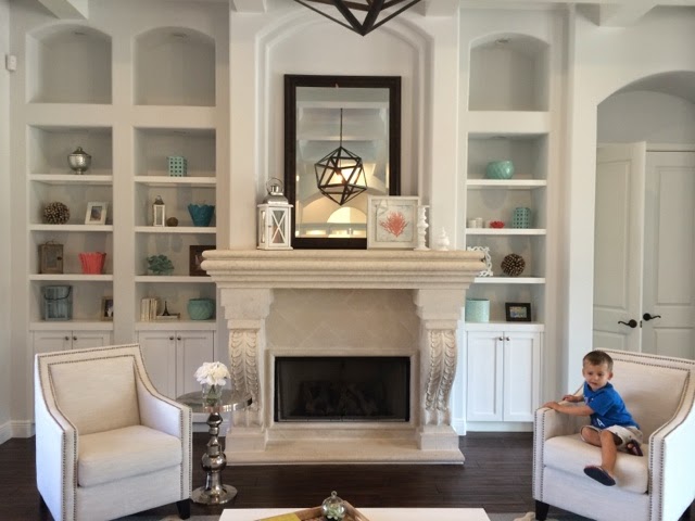
As mentioned in previous posts, we added the coffered ceiling detail, painted the cabinets and had new doors and shelves made, painted the walls (Sherwin Williams Ice Cube) and added new wood-look tile flooring in this room.  
Chairs are from Overstock.   Little Two is not for sale…yet.
Coffee table is from Wayfair.  Rug from Rugs USA.

This is the first thing you see when you enter our home.  The ceiling turned out to be such an statement when you walk in.

The light.  Can we just talk about the light?  I am head over heels for the funk and fun this light brings to the room.  Something more traditional would have made this room classic, but definitely a little stuffy.  This light adds just the right amount of fun to the room, in my opinion.  The polyhedron light is from Restoration Hardware.

Panoramic from dining room to living room

Dining Room

Chandelier and sconces are Quoizel from Wayfair

Pass through/bar

Master Bath

Panoramic of master bath.  More info on the bathroom in this previous post.


Friday, January 24, 2014

Kitchen Completion

The biggest area of the house that we remodeled was the kitchen.  I spend most of my day in the kitchen, so I knew it had to be something that I felt at home in.  I wanted bright, light, airy and neutral enough where I could add pops of color as trends change.  We haven't had a chance to buy any decorative accessories yet, but I love the overall look so far.  I wish I were better with the camera and lighting, but here are the new kitchen photos:


Kitchen Before
Kitchen After

We added white shaker cabinets with Caeserstone Quartz (color Pebble) countertops around the perimeter of the kitchen and white carrara marble on the island.  

************

Pantry Before
Pantry After
We decided to remove the walk in pantry and make a full wall of cabinets.  The cabinets to the left have deep pull out drawers where we keep our pantry items.  The large rectangular cabinet to the left of the oven is a appliance garage with electricity.  We keep our coffee pot nestled away in there, which leaves our counters nice and clutter free.


Another view of the pantry wall


*******

Wolf 6 burner range

********

Backsplash

I am obsessed with this beveled arabesque backsplash from Mission Stone and Tile.  I ordered this online and I was worried about their shipping and packaging methods.  I found that everything was wrapped securely and the delivery man with very careful when bringing the pallet to the house.  Not one tile was broken.  


A closer look.  The color is reading slightly yellow here (I am no photographer!)


************

Lighting
We fell in love with some globe pendants that arrived missing some pieces on delivery.  The company was unable to complete the order, but we found these globe pendants from Pottery Barn that are very similar.  They are really growing on me.  All other lighting in the kitchen was switched to LED lights.


***********

Sink
I knew I wanted a single trough sink in our kitchen because the boys were always throwing food in the non-disposal sink at our old house and the drain was a mess.  I am in love with our choice of this Kraus sink that we bought from Faucet Direct.  Unlike some large rectangular sinks, this one has slightly rounded edges to keep food from getting stuck in the corners.  It is also large enough to hold any large pot that I own.  I can also soak the grates of my gas range and they fit with room to spare!  This sink is incredible!!!  The faucet is Delta, also from Faucet Direct.


**********

Island Time
We chose to go with white carrara marble for the countertop of the island.  I love the soft , organic look of the veining.  If you are considering marble though, it is everything you read about.  It will stain, it will etch.  You have to be ok with that.  I found that buffing the etches with steel wool will help.

The coloring is so beautiful.

View of the other side of the island.


*************


Hood

The hood.  Sigh.  It is lovely, but it is too low for my liking.  We have hit our heads on it several times.  I would have liked it a few inches higher.  Perhaps helmets while cooking will become the new norm in our home.  

*********

Fridge Area


*************** 


Wet Bar/Pass Through to Living Room


***********


Floors
 Did you know you were looking at tile?  As discussed in previous posts (Black is the New Black), we had wanted hardwood floors, but with two young boys, toy trucks, and a pool, we decided it was not in our best interest.  After months of searching, we found a wood look tile that we like.  It looks very much like real hardwood.  Interestingly, we find that it looks different in different lights.  If you didn't know it was tile, scroll back up and look through the photos again.  You might be surprised at how real the tile looks.  Most people don't know it is tile until we tell them.  Tile is American Heritage by Marazzi in the color "Spice."


*******

Eat In Kitchen


I leave you with a pict of one cute little helper!  Little One wanted to be in a photo.  Little Two was down for a nap or he would have climbed up there too!